For the cap, I had a concept of taking the shape of the peak and multiplying it around the hat in loads of different crazy prints. Hopefully so you would see little bits of everyone from different angles. I mocked this up in paper as so ---->
Showing posts with label Colourful. Show all posts
Saturday, 11 February 2012
New Era XC Cap Design Competition 2010
After finishing my BA degree and with the luxury of an entire summer of free time before diving into my next course the RCA, I decided to enter a competition to re-design New Era's iconic baseball cap. Probably not the most obvious thing for a knit designer to do, but it was a new challenge with a £10k prize up for grabs, so I said why not and gave it a go. Before embarking on building a sculptural piece of 'head art', I had been building a sketchbook of art deco inspired imagery that I thought could look quite cool if it was blown up onto jumpers, so it came in handy when I wanted so funky graphics for my hat.
For the cap, I had a concept of taking the shape of the peak and multiplying it around the hat in loads of different crazy prints. Hopefully so you would see little bits of everyone from different angles. I mocked this up in paper as so ---->
So, armed with a blank canvas cap, some super cool paint pens and markers courtesy of New Era, and electrical tape and a bit of knit, I created this work of art. A bit random and slightly unwearable, but it went into an exhibition which travelled around the globe and I now have a very posh coffee table book with all the entries (including mine) in. Oh and the nice people at creative review also featured it on their blog here.
For the cap, I had a concept of taking the shape of the peak and multiplying it around the hat in loads of different crazy prints. Hopefully so you would see little bits of everyone from different angles. I mocked this up in paper as so ---->
Sunday, 5 February 2012
NEON
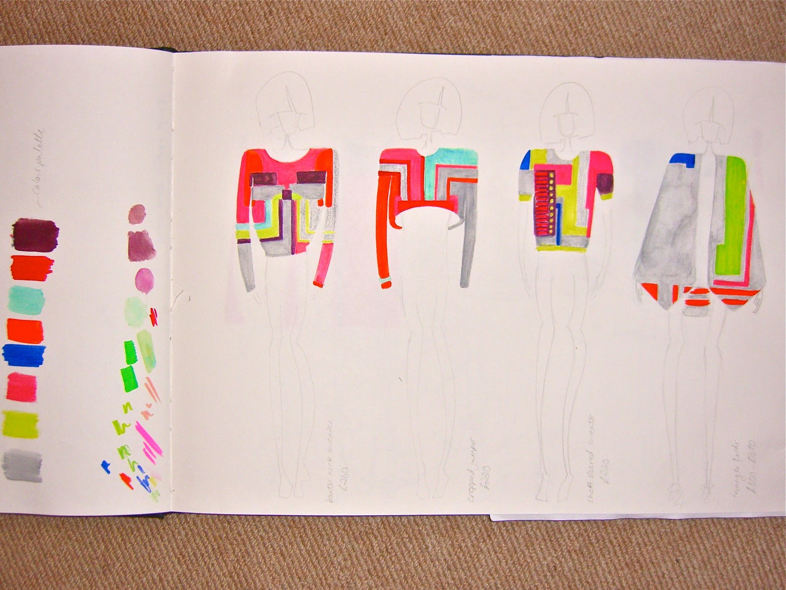
Many of you will know, I LOVE neon and I had slightly forgotten this until I started adding it into colour palettes I was making today. In celebration of my renewed relationship with fluorescence, I have decided to show you a sketchbook I did whilst on my foundation course. There was a lot of neon, more electrical components and some slightly questionable sportswear design ideas, but it's a fun and very playful, so put on your sunglasses, you're going to need them!
Monday, 16 January 2012
Bold and Bright Blocks and Lines
As I've now got the bit between my teeth to crack on with my final collection, my blog posts might become a little less frequent for the time being. My days will most likely to be spent within the creative confines of the RCA, but never fear, more colourful loveliness is always just around the corner...
This is a quick collection I started to design before the summer, inspired by the bold graphic paintings of Peter Halley. I've got the idea exactly in my mind about how to knit the fabrics for these garments so fingers crossed they will be available to buy one day in the future!
| Peter Halley Artworks |
| Peter Halley Artworks |
| Colours! |
Thursday, 5 January 2012
Umbro 2011
Around March 2011, I attended a design briefing by Umbro, which was about taking inspiration from, and re-inventing 4 of their iconic menswear pieces. The idea of designing menswear initially sent me running for the hills (not a field I'd even contemplated exploring before), however after a shaky start working with the most boring colour palette I'd ever come up with, (I'm not featuring that bit), I decided to break all the rules by thinking football loving men would wear purple and got completely sucked into the project, resulting in my designs being chosen for the winning collection.

I took my inspiration from the Umbro flicker archive of football shirts, mainly the huge variety of colours and directions of stripes found on the shirts. Following this, I worked on a concept of designing scarves which could sit on top of a football strip for fans to wear when attending a match. I ended up making a final piece which was an interpretation of a jacket lapel, enabling a simple t-shirt to be worn underneath which would then look far smarter and more exciting with the addition of the scarf.
The final collection was a collaboration between Footwear, Menswear, Textile and Vehicle design students from the RCA. As a team we exhibited our pieces in an exhibition alongside the RCA Fashion Shows 2011 in our own Umbro locker room - see below!

Saturday, 24 December 2011
What can you do with a straw after drinking a cocktail?
A body of work which I exhibited at the RCA Fashion and Textiles 'Work in progress' January 2011. Who knew there were so many ways to incorporate straws with knitting!
Some bug eye lens pictures of my inspiration drawings.
You can also find more images on the ARTS THREAD blog here
Subscribe to:
Posts (Atom)